 |
| The above map is an example of an Unclassed Chloropleth Map. Unclassed chloropleth maps are a good visualization technique to portray statistical data. This map shows the frequency of lightning strikes in the United States. Maps of this type represent data through changing shade of color. In this case, the places with most frequent lightning strikes are pink and orange. http://www.weather.gov/os/lightning/images/Vaisala_96-05_Flash_Map.gif |
Sunday, December 5, 2010
Unclassed Chloropleth Map- Lighning Strikes
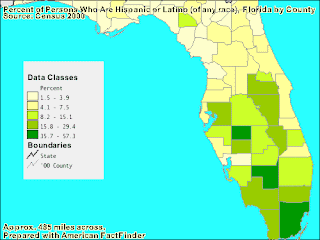
Classed Chloropleth map
 |
| The map above is an example of a classed chloropleth map. A classed chloropleth map compares sets of data against each other. The difference in data is shown through a visual aid, in this case by shades of green. This map is showing the percentage of Latinos located in each county in Florida. In this case, the data being compared is Latinos compared to other races in the counties population. https://blogger.googleusercontent.com/img/b/R29vZ2xl/AVvXsEiFfoEAbf0Q3D1REvs1nC7hSI1UWjl1vM07b7rfhGPi3KCUqz8J_NdvbN8CG19pNgFs7vBlDNar7L_LbAsA_yh7O3lorkj7cAuLyoSLive68jqC-zMoFD2RDv1FbBLVkK8qfticfa4qz78/s320/classed+choropleth+map.gif |
DOQQ
 |
| DOQQ stands for Digital Orthophoto Quadrangle. A DOQQ generally shows a aerial photo with UTM coordinates overlain. The coordinates allow the viewer to have an idea of the geographic size of the land in the photo. This is an infrared aerial photo of what I believe is Texas. http://www.fmepedia.com/index.php/Raster_Mosaicking_Scenario |
Hyposemetric map
 |
| A hyposemetric map is a visual representation of elevation. It often demonstrates elevation through contouring. Although, other techniques like shading, and combination with remote sensing images allow these types of maps to be a good representation of their geographic area. This is a hyposemetric map of the foreign country Bitola's topography http://www.bitolaonline.com/maps.htm |
Triangular plot
 |
| A triangular plot is a map showing a data set overlain on a triangle. It is systematically set up to portray data through color visualization, and coordinates portraying numerical data. This triangular plot shows election data. with the percentages and colors portraying how many votes a certain party is projected to reeive.http://www.ex-parrot.com/~chris/wwwitter/20050407-it_doesnt_matter_how_you_vote_either_way_your_planet_is_doomed.html |
DEM
 |
| DEM stands for digital elevation model. It is a form of remote sensing that allows us to visualize the elevation of land. This DEM image is of some mountains in California. We can very easily see where the peaks and valleys are in this mountain range. You can also tell which mountains are higher in elevation with DEM.http://www.humboldt.edu/geology/courses/geology350/350_maps_airphotos.html |
Isopleth
![[phfield.gif]](https://blogger.googleusercontent.com/img/b/R29vZ2xl/AVvXsEjb__pGK-KBjdotysAlLRIIUYr56B8LfbaVQO6L3l9dbNy4SuX3C4h_pDvI1MZ4tvUr7NvvLp2FixJKvfgkNcdapXJa4UnFMo4rMKEdyGHVJrrU1qh0EXdLVSnmhUaMFr4OCtkVTzTOLc42/s400/phfield.gif) |
| An Isopleth map displays a data set through visualization. In this case, hydrogen ion concentration as measured by ph is being portrayed for the lower 48 U.S. A scale is given to interpret the colors, and some of the data is presented in the form of numbers directly on the map.http://www.weathernotebook.org/images/winter/3.jpg |
Subscribe to:
Posts (Atom)