 |
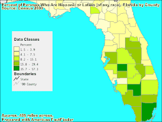
| The map above is an example of a classed chloropleth map. A classed chloropleth map compares sets of data against each other. The difference in data is shown through a visual aid, in this case by shades of green. This map is showing the percentage of Latinos located in each county in Florida. In this case, the data being compared is Latinos compared to other races in the counties population. https://blogger.googleusercontent.com/img/b/R29vZ2xl/AVvXsEiFfoEAbf0Q3D1REvs1nC7hSI1UWjl1vM07b7rfhGPi3KCUqz8J_NdvbN8CG19pNgFs7vBlDNar7L_LbAsA_yh7O3lorkj7cAuLyoSLive68jqC-zMoFD2RDv1FbBLVkK8qfticfa4qz78/s320/classed+choropleth+map.gif |
Sunday, December 5, 2010
Classed Chloropleth map
Subscribe to:
Post Comments (Atom)
No comments:
Post a Comment