 |
| This bivariate map is very interesting as it portrays the 50 states of the U.S. and the distribution of poverty in the states. There seems to be a dividing line in the middle of the country, with the Northern half of the country experiencing very low poverty rates, while the Southern half of the country experiencing very high poverty rates. One might often think the opposite of what the data portrays, with the favorable climate of the south, yet the numbers don't lie. http://www.cdc.gov/pcd/issues/2007/oct/07_0091.htm |
Sunday, December 5, 2010
Bivariate Choropleth Map- Poverty statistics of America
Univariate Choropleth map
 |
| A univariate choropleth map is one that displays a single variable or attribute over a large area, and its magnitude. The data is displayed generally by a similar color scheme. This map shows the distribution of hay throughout counties in the United States. The counties with the most hay are shaded a dark green, with counties producing less hay outlined in light green. http://www.nass.usda.gov/ |
Planimetric Map

| A planimetric map shows how a developed area has been planned and zoned. It portrays features such as roads industrial buildings, residential buildings, etc. It ignores topography, and vegetation, only showing the anthropocentric nature of the geographic area portrayed. This is a planimetric map of a location in North Carolina. http://www.ncdot.org/doh/preconstruct/highway/photo/Products/Planimetric_maps_default. |
Standardized Choropleth map- GDP
 |
| A standardized choropleth map compares a similar data set or variable shared by different places through a systematic classification system. The map above show a comparison of GDP throughout the countries of the world. The countries with high GDP are filled in dark blue, while the countries with low GDP are colored light blue http://www.componentone.com/SuperProducts/MapsSilverlight/ |
Classed Choropleth map
 |
| The map above is an example of a classed choropleth map. Maps of this type display data through a color visualization method. Each color correlates to a certain range of data output for a certain county. This classed choropleth map portrays beef cattle emissions in 18992 in all the counties in North Carolina. The deeper in the red the county gets, the higher they're emissions are. http://personal.uncc.edu/lagaro/2101/2101_ProjectsS2001/beefmethaneJMK.gif |
Cadastral map
 |
| A cadastral map shows how a geographic area is developed, or plans got be developed. It shows the locations of roads, buildings, infrastructure, rivers, greenways, etc. A cadastral map can be very useful in places like theme parks, malls, and college campuses. http://www.spaceage.co.in/cadastral-surveys.php |
Propaganda map
 |
| A propaganda map is a visual falsification of anything, as to influence people to think a certain way. This map has a very American view, as it classifies the world according to Ronald Reagan. It is very bias toward U.S. interests, which is clear with how large the United States appears on the map. http://bigthink.com/ideas/21087 |
Dot distribution map- The Wal-Mart virus
 |
| A dot distribution map shows a distribution of data by placing a dot in the location representing the data. THis dot distribution map shows the growth of Wal-Mart in the U.S. It is referred to as the Wal-Mart virus, because of the rapid growth and expansion of Wal-Mart. http://www.geog.ucsb.edu/~jeff/gis/proportional_symbols.html |
Proportional circles map
 |
| A proportional circles map is one that compares data of different places through a spread of circles. The larger the circle is, the greater the magnitude of data. In this proportional circles map, internet usage throughout Europe is being portrayed. http://www.geog.ucsb.edu/~jeff/gis/proportional_symbols.html |
Cartographic Animation
 |
| A cartographic animation is an image portraying real time movement of features like weather, wind, hurricanes, etc over a geographic. The image above is of a band of rain moving through Louisiana. It was taken from a loop, which shows real time weather when viewed. http://www.gearthblog.com/images/images1006/noaa.jpg |
Bivariate Choropleth map- Purple America
 |
| A bivariate choropleth map compares two different variables of data as one visualization. The two sets are generally differentiated by color. The image above is known as Purple America. It shows the voting results of the 2004 election divided between Democrats and Republicans. The purple areas represent places where the political preferences are very diverse, and there is not a strong presence of one or the other, but rather equal distribution. http://www.princeton.edu/~rvdb/JAVA/election2004/purple_america_2004.gif |
Concept map- Climate change
 |
| A concept map is a very simple way to visually portray ideas. It starts with a central concept box, with components branching off making up and proving the concept. In this concept map, the central point is climate change. The author of the map then makes branches about how it is caused, evidence of it, and how it can be managed. A concept map is a useful tool when trying to develop a research topic, or make a plan. http://library.uvic.ca/site/lib/instruction/research/devtopic.html |
Scatter plot
 |
| A scatter plot is a visual representation of correlating data sets. A scatter plot is similar to a bar or line graph, with a slightly different presentation. This scatter plot shows how a group of people's weight corresponds to their height. The scatter plot shows that generally, as height increases, so does weight. However, there is some outlier data on both ends of the graph. http://courses.statistics.com/software/Excel/XLpul3.htm |
Population profile of the United Arab Emirates
 |
| This population profile greatly intrigued me so I decided to share it. It is comparing population differences in regards to sex and age in the United Arab Emirates. It is interesting to note that in the early and late stages of life, the male population is nearly equal the female population. However, in the middle stages of life, the male population more than doubles the female population. Is this due to the ethical standards of the UAE? Very interesting to note. http://www.populationaction.org/Publications/Reports/ The_Shape_of_Things_to_Come/Chapter _Six_Subtypes_and_a_Speculative_Structure.shtml |
Lorenz curve- income in the U.S.
 |
| The map above demonstrates a Lorenz curve, a connected curved line of data points relating one set to another. This Lorenz curve shows the distribution of income among house holds in the United States. As you can see, there is clearly a misbalance in distribution of income, with only about 20 percent of households making almost 50 percent of the total income. http://www.rethinkingschools.org/restrict.asp?path=archive/19_03/inte193.shtml |
Nominal Area Choropleth map
 |
| The image above is a great example of a nominal area choropleth map. Maps of this type represent nominal data in unrelated geographic areas. Nominal data can be data regarding gender, race, class, ethnicity, etc. This is a map of several European countries, and the colors have no rhyme or reason to them, they each represent data of that individual country. http://web.cs.wpi.edu/~matt/courses/cs563/talks/nominal_data/geopolitical.gif |
Unstandardized Choropleth map
 |
| The above image is an example of an unstandardized choropleth map. This type of map is useful to display statistics for a large area like a state or country. However, it is not always representative of the more local levels of populations, like counties or towns. This map shows the percent change of the population of each state. Its visualizatition method is displaying statistics through color. http://www.census.gov/population/www/pop-profile/sttrend.html |
Unclassed Chloropleth Map- Lighning Strikes
 |
| The above map is an example of an Unclassed Chloropleth Map. Unclassed chloropleth maps are a good visualization technique to portray statistical data. This map shows the frequency of lightning strikes in the United States. Maps of this type represent data through changing shade of color. In this case, the places with most frequent lightning strikes are pink and orange. http://www.weather.gov/os/lightning/images/Vaisala_96-05_Flash_Map.gif |
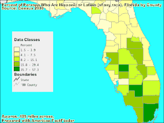
Classed Chloropleth map
 |
| The map above is an example of a classed chloropleth map. A classed chloropleth map compares sets of data against each other. The difference in data is shown through a visual aid, in this case by shades of green. This map is showing the percentage of Latinos located in each county in Florida. In this case, the data being compared is Latinos compared to other races in the counties population. https://blogger.googleusercontent.com/img/b/R29vZ2xl/AVvXsEiFfoEAbf0Q3D1REvs1nC7hSI1UWjl1vM07b7rfhGPi3KCUqz8J_NdvbN8CG19pNgFs7vBlDNar7L_LbAsA_yh7O3lorkj7cAuLyoSLive68jqC-zMoFD2RDv1FbBLVkK8qfticfa4qz78/s320/classed+choropleth+map.gif |
DOQQ
 |
| DOQQ stands for Digital Orthophoto Quadrangle. A DOQQ generally shows a aerial photo with UTM coordinates overlain. The coordinates allow the viewer to have an idea of the geographic size of the land in the photo. This is an infrared aerial photo of what I believe is Texas. http://www.fmepedia.com/index.php/Raster_Mosaicking_Scenario |
Hyposemetric map
 |
| A hyposemetric map is a visual representation of elevation. It often demonstrates elevation through contouring. Although, other techniques like shading, and combination with remote sensing images allow these types of maps to be a good representation of their geographic area. This is a hyposemetric map of the foreign country Bitola's topography http://www.bitolaonline.com/maps.htm |
Triangular plot
 |
| A triangular plot is a map showing a data set overlain on a triangle. It is systematically set up to portray data through color visualization, and coordinates portraying numerical data. This triangular plot shows election data. with the percentages and colors portraying how many votes a certain party is projected to reeive.http://www.ex-parrot.com/~chris/wwwitter/20050407-it_doesnt_matter_how_you_vote_either_way_your_planet_is_doomed.html |
DEM
 |
| DEM stands for digital elevation model. It is a form of remote sensing that allows us to visualize the elevation of land. This DEM image is of some mountains in California. We can very easily see where the peaks and valleys are in this mountain range. You can also tell which mountains are higher in elevation with DEM.http://www.humboldt.edu/geology/courses/geology350/350_maps_airphotos.html |
Isopleth
![[phfield.gif]](https://blogger.googleusercontent.com/img/b/R29vZ2xl/AVvXsEjb__pGK-KBjdotysAlLRIIUYr56B8LfbaVQO6L3l9dbNy4SuX3C4h_pDvI1MZ4tvUr7NvvLp2FixJKvfgkNcdapXJa4UnFMo4rMKEdyGHVJrrU1qh0EXdLVSnmhUaMFr4OCtkVTzTOLc42/s400/phfield.gif) |
| An Isopleth map displays a data set through visualization. In this case, hydrogen ion concentration as measured by ph is being portrayed for the lower 48 U.S. A scale is given to interpret the colors, and some of the data is presented in the form of numbers directly on the map.http://www.weathernotebook.org/images/winter/3.jpg |
Infrared Aerial photograph-San Diego, CA
 |
| This is an infrared aerial image of San Diego, California. It's imagery is the same as a regular aerial photo, but all the color on the map is falsified. Generally it is returned back as red, and is a useful way to distinguish urban areas from natural areas. Aerial photography is useful in tracking storm systems and hurricanes as well.http://californiamapsociety.org/mapping/remote.php |
Aerial photograph- Downtown Chicago
 |
| The image above is an aerial photo of downtown Chicago. The city is visible, along with the shoreline of Lake Michigan. Aerial photography reveals a great deal about the geography of an area, along with a detailed picture of the various landforms and vegetation. In this case, there is no vegetation and the city expands in all directions.http://commons.wikimedia.org/wiki/File:Chicago_Downtown_Aerial_View.jpg |
Isotach
 |
| An Isotach map is one that displays lines of equal wind speed. This isotach shows the wind speeds in the Southeast U.S. and the Gulf of Mexico. AN isotach also displays the direction from which the wind is moving. This image shows converging winds in the center because an area of low pressure is forming. http://www.wunderground.com/blog/JeffMasters/comment.html?entrynum=1456&tstamp=&page=5 |
Isohyets-Hurricane Camille
 |
| The map above is know as an isohyet map. Isohyets are lines of equal precipitation. The image above portrays isohyets from Hurricane Camille in Virginia. Generally, the heavier lines of precipitation are in the center of a isohyet image, and as you go outward, precipitation decreases. The above image measures precipitation in inches, and some areas received up to 25 inches of precipitation.http://pubs.usgs.gov/of/1999/ofr-99-0518/ofr-99-0518.html |
Saturday, December 4, 2010
DRG- Denver, CO
 |
| DRG stands for digital raster graphic. A DRG map like the one displayed above is a scan from the USGS series of topographic maps. The scan displays all the cartographic information, as well as spatial data. This is a DRG map of Denver, CO in 1899. The newer USGS maps are much more detailed and most likely more accurate.http://www.ghostdepot.com/rg/maps/drg%20map%201899%20red.jpg |
DLG
 |
| The map above is an example of a DLG (digital line graph) map. A DLG is a digital visualization of geographic areas. For example, this is a map of roadways and rivers surrounding a ranch. Based on this visual aid, a traveller can get an idea of what the land looks like.http://dlgranch.com/location.html |
Range graded proportional circles map
 |
| A range graded proportional circles map shows a display of data through a distribution of circles or red dots. The map above shows the Hispanic population throughout the United States. Each dot equals a population of 100,000 hispanics.https://www.e-education.psu.edu/natureofgeoinfo/book/export/html/1553 |
Subscribe to:
Comments (Atom)